Yep, just provide a link to the comment to start the split at and I can do it for all subsequent replies.
2 Likes
That’s almost certainly mine, and most messages since then have been about style
2 Likes
Thanks @encukou , and sorry about that—those are really details that are far below the PEP level ,and I’m probably the worse offender there. @brettcannon Yeah, like @EpicWink basically everything after that comment can be split, as it is almost exclusively related to details of the style, typography, rendering, etc (and to be clear, more my fault than anything) rather than the PEP itself. Once the thread is created, I’ll reply there with my further feedback (glad I took a break from it for a bit, or this OT thread would be even longer, heh).
1 Like
Thanks @brettcannon, I agree Laurie’s post is where I’d start (https://discuss.python.org/t/request-for-comment-making-pep-rendering-self-contained/10774/56)
A
1 Like
Dark mode:
This image (and possibly others) need adapting for dark mode:

One option is to replace the background transparency with white, and show it white in dark mode.
Another is to switch the image for another with a dark background.
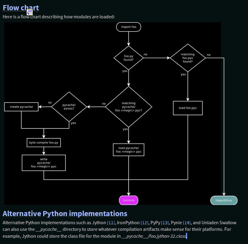
Or use filter: invert(1) CSS (for example), which would give something like:
3 Likes
Good catch; I just noticed that too.
This was my first thought too, but it wouldn’t look so good and still require modifying each original image to add it, a non-trivial amount of work especially for older PEPs, and which wouldn’t look as good anyway.
I’m personally a bit averse to bespoke hacks in the dark theme CSS/JS for specific PEPs, which switching the image would require, as far as I’m aware.
This seems like the best solution; anchors as in the linked example technically work (via .. invert-image: or similar) but only for one image per page; .. rst-class:: invert-image is a much cleaner solution. CSS filters and the invert() function should be usable on all browsers we support.
One note about SVGs: per MDN via caniuse, “CSS property: filter: On SVG element” is listed as unsupported for all browsers but FF, so if images are not dark mode compatible, we would need to retain PNGs for those images (which currently all displayed images are).
I surveyed the other images that might need this; expand the details sections to view screenshots
-

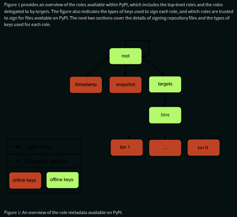
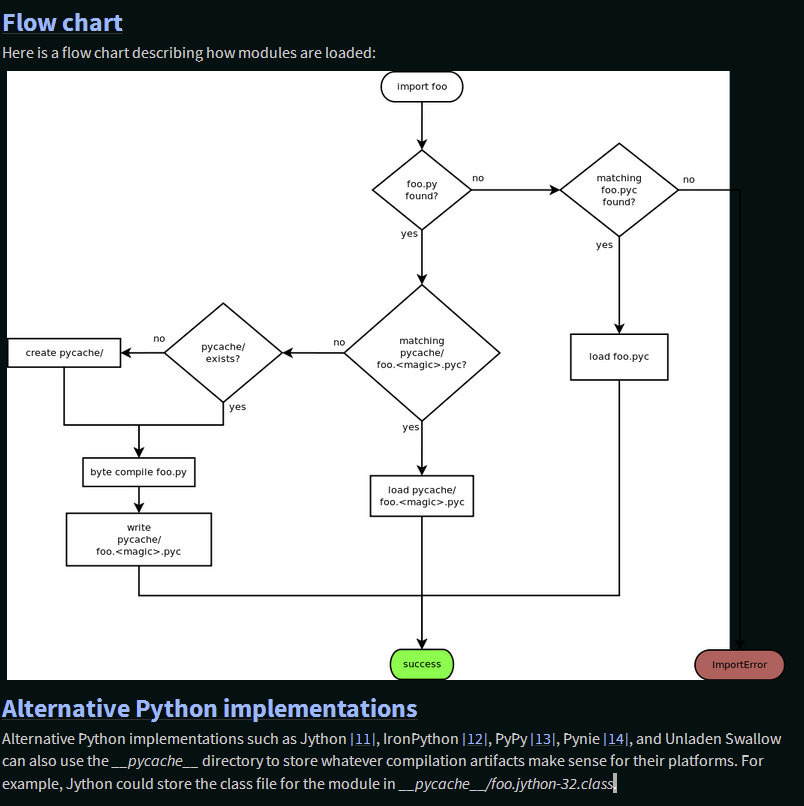
pep-0458-1.png: Arrows between flowchart notes, and other outlines, are invisible; inversion results in a somewhat less conventional color scheme but a far more readable chart. -
pep-0480-1.png: Matches PEP 458 image; see previous entry. -

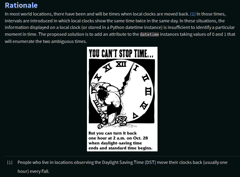
pep-0495-daylightsavings.png: Two-tone image, so could be inverted, but not necessary, doesn’t look great and disturbs integrity of original image. -
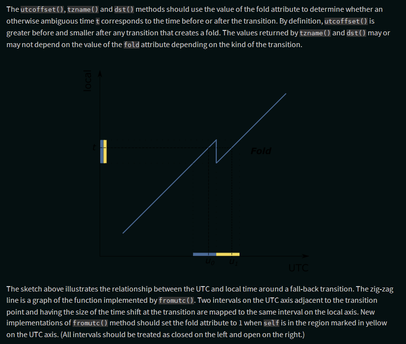
pep-0495-fold-2.pngandpep-0495-gap.png: Needs inverting, as is vector graphics and text is invisible otherwise, which inverting fixes just fine. -
pep-0525-1.png: Looks okay without inverting, but looks even better with it, with higher contrast on the key features while being less blaring on the eyes. -
:
pep-532/circuit-breaking-protocol.svg: It already users background colors for its flowchart boxes, but the arrows between them are black and invisible; while the inverted look isn’t ideal, it is clearer than the alternative. -
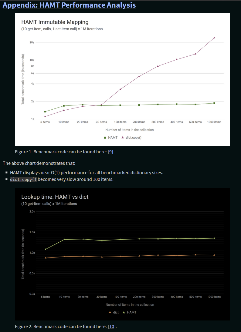
pep-0550-hamt_vs_dict-v2.pngandpep-0550-lookup_hamt.png: Have full white backgrounds, so still read okay without inversion, but are line art and look much less visually jarring and eye-straining with it. -
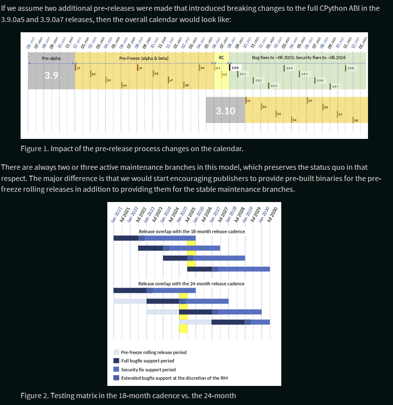
pep-0602-example-release-calendar.pngandpep-0602-overlapping-support-matrix.png: Have a white background, so look rather bright, but rather complex and with deliberately chosen colors, so should not invert these. -
pep-0602-hamt_vs_dict.pngandpep-0602-lookup_hamt.png: Identical figures to those on PEP 550, so same conclusion. -
pep-0605-example-release-calendar.pngandpep-0605-overlapping-support-matrix.png: Same two basic figures as on PEP 602 with minor content differences, so same conclusion applies. -

pep-3147-1.png: Mostly has a white background, but has a strip of transparency down the side (which should be fixed manually). Thus, is readable in dark mode but renders poorly, which inverting mostly fixes.


1 Like
Thanks both for the detailed investigations.
I’m reticent to do much significant work here in the design space. What’s the prior art for handling images in websites with “well implemented” / thoughtful dark modes?
If every image was an SVG (it looks like most could be made SVGs), it would be possible to do CSS variable styling, but I really don’t want to get that complex.
Filter invert also seems pretty odd on the ones with colours outside of pure black/white/grey, but is simple.
A
Generally speaking, in my limited experience browsing and creating such, graphics/UI elements/line art either has transparent backgrounds and color choices that contrast well with both surrounding colors, or alternate versions for the light and dark themes that get swapped in via CSS. We’re dealing with a somewhat different case than most here in that pretty much all the images are inline in the content, not part of the site UI, and are plots, charts and other line art rather than photographs, graphics, etc, and where they contain critical information, not just decorate or even just complement the text.
Yeah, but we’d need to inline the SVGs into the page, filters wouldn’t work and we’d be dealing with the complexities of browser SVG feature support, which is a whole other can of worms, and the practical reality is that we only have SVG versions for a couple of the images.
Yeah, I noticed, but without more complex manipulation I’m not sure of an easy way around that. The most conservative approach would be only applying it to the cases where it is strictly necessary for all elements of the figure to be visible (i.e. ![]() , not
, not ![]()
![]() ), even if those with white backgrounds do look rather blaring in the dark theme.
), even if those with white backgrounds do look rather blaring in the dark theme.
With a bit of work we could potentially provide a CSS class-based mechanism (or even a custom Sphinx directive) to swap out images for light and dark versions if future authors provide them, but that’s a lot of work on both sides for a relatively modest benefit for a small number of cases.
I had a look at the new PEP website and, as has already been brought up in this thread, there’s a minor quirk with the formatting of PEPs on the new site, e.g. PEP 630 – Isolating Extension Modules | peps.python.org

Code snippets in the text are rendered much larger than regular text, which looks odd.
The fix is easy: simply add a font-size to the pre, code CSS:
pre, code {
  font-family: ui-monospace, "Cascadia Mono", "Segoe UI Mono", "DejaVu Sans Mono", Consolas, monospace;
  white-space: pre-wrap;
  word-wrap: break-word;
  -webkit-hyphens: none;
  hyphens: none;
  font-size: 0.8rem;
}
With this change the code snippets look “right” again (at least in my browsers).
Thanks for posting here. As mentioned in my reply on the other thread directing you here, this issue in particular has been discussed at length above (without resolution yet).
The issue is that the apparent size is quite different between the different font options in the (system) font stack, so a size that works for one font to match the sans font won’t work for another. My proposed simple solution to this is to just use a web font like Inconsolata, while others preferred using a standard system font stack, which has some (in my view modest) advantages, but results in different looks on different OSes, versions, browsers, etc. (requiring much more testing and leaving us open to edge cases like this) and in particular, depending on the variable combination of sans and mono fonts, resulting in the two potentially having very different sizes (in different directions) depending on which combination a system happens to have.
It’s fairly common for websites to use a smaller font size for inline code.
Most Sphinx themes already do this. I don’t see why PEPs shouldn’t do the same?
Beyond that, 0.8125rem would result in a round number font size in px, which might be desirable. ![]()
1 Like
There’s no indentation for definition lists, which negatively affects some PEPs (I saw this on 609).
The whitespace (line height + margin) for paragraphs and heading seems… somewhat tight which makes it a bit difficult to read. Would a PR adjusting these be welcome? Notably, do people consider something like this controversial?
I see that the font question is going through a bunch of discussion, and I’m gonna keep away from it. If someone has mentioned using the system font stack, great. Otherwise, I’ll note that it’s an option and also what Furo uses.
3 Likes
Yes, I’d say PRs to improve readability, usability, accessibility and so on are welcome especially when backed up by best practices / WCAG etc.
2 Likes
Sure, so long as it doesn’t dip too low that readability is impaired-I’d suggest at least 14 px/0.875 rem to meet the minimum (IIRC) for WCAG AA accessibility standards. The issue with relying on a system font stack gere, though, is that the rendered size varies significantly between different mono fonts, so they may end up substantially bigger or smaller than intended at any given size, and may vary more widely from the sans font (which also varies).
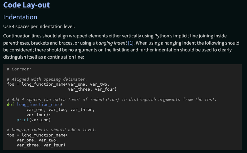
For example, at font-size: 0.8125 rem, DejaVu Mono and Liberation Mono (default on most Linux) both look fairly reasonable (DejaVu Mono shown):
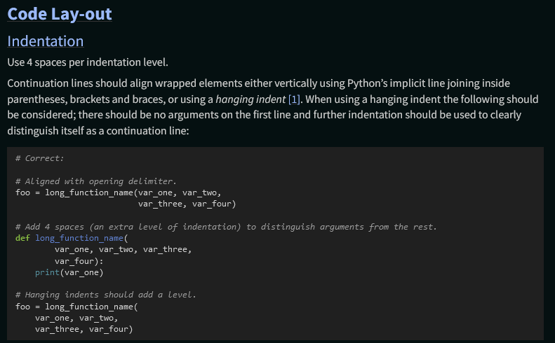
Consolas (the default on Windows), however, is significantly smaller:
Yep, there’s several other styling tweaks we need to do with them; see python/peps#2300. Adam said he’s going to be busy for at least the next few weeks if not longer with school stuff, so if he can’t take care of it in the next day or so (since after that is when he said he’s going to be taking a break, FYI), you or I can take care of it.
Agreed with @hugovk , I’m a strong ![]() on PRs improving readability, usability and accessibility when issues arise.
on PRs improving readability, usability and accessibility when issues arise.
@hugovk did, citing your Furo. It certainly can make sense in a large, popular, general-purpose theme like Furo, where the goal of the project is ensuring the theme looks good across platforms, OS versions, browsers and user configs.
My big concerns for the PEPs, where favoring a well-defined, unified cross-platform design language is more justifiable, center around the consistency and maintainability of the theme’s “look” across many different possible combinations of sans, serif and mono fonts, given how (per my testing above) these can vary widely depending on the aforementioned variables outside of our control, and ensuring that the intended relationship of the mono and sans font sizes is fairly consistent (though making it further apart, as proposed here, reduces though not eliminates the latter concern).
As someone experienced using a system font stack for a popular Sphinx theme, it would be very helpful if you had anything to share wrt your experience with it, how you test to ensure your theme’s look is correct and consistent across the variables and that there aren’t problematic edge cases, and how you deal with the relationships between sans, serif and mono fonts varying substantially between them?
I would still like to explore system fonts — there are some speed benefits too (although I’m personally biased as I have bad broadband!)
As Cam said I’ll be away for a few weeks, but just recording my vote! There’s a live PR to fix the <dl> issue.
A
1 Like
For the record, see python/peps#2425 for that PR.
1 Like
It could be useful to compare existing Furo sites across systems. For example this urllib3 page looks fine to me with macOS/Chrome:
How is it in Windows?
Its important to specify OS version as well, as the monospaced fonts available, and the one that would be selected, change depending on that (never mind those that users might have installed, as some of those listed are freely installable by users, and others are installed by common cross-platform software packages such as MS Word, LibreOffice and Adobe products).
On macOS, before 10.6 Monaco would be used, between 10.6-10.11 would be Menlo, and from 10.11 at last to the present would be SFMono (though who knows when Apple will change it up again).
On Linux/BSD, most recent distros include Liberation Mono and/or DejaVu Mono (which the PEP one and other system font stacks include), but it seems some don’t and would fall back to the default (often Courier/Courier New).
On Windows, through 7 Lucida Console would be selected, with Consolas used above that; Segoe UI Mono is the “standard” mono font on 8.1+ and is used in the “standard” system font stack on on the PEPs, and Cascadia Code (also listed in the latter two) would be selected on Windows 10+ systems with Micorsoft’s open-source Windows Terminal installed, which may become the default in a future Windows version.
However, despite researching the above, on the Windows 8.1 Pro system I tested on, I get Consolas in both Furo and the PEP theme, even though per the docs I should get Segoe UI with the latter (and in fact get DejaVu/Liberation instead, since I have LibreOffice installed and its above Consolas there).

It looks rather small, though not unusably. But all this complexity is why I’d really prefer to leave this sort of thing to sites with full-time UI/UX teams (or at least themes who’s primary purpose is being a frontend) and just use one consistent web font, unless we switch to an existing tried and tested theme like Furo.
You can use the font-size-adjust property to address such differences.
Example:
pre, code {
  font-family: ui-monospace, "Cascadia Mono", "Segoe UI Mono", "DejaVu Sans Mono", Consolas, monospace;
  white-space: pre-wrap;
  word-wrap: break-word;
  -webkit-hyphens: none;
  hyphens: none;
  font-size-adjust: 0.486;
}
The adjustment size can be determined with a tool such as this tool. The above is the aspect ratio of Source Sans Pro, the main font used for text on the pages.
BTW: It’s probably better to use the pre, code font family definition from python.org, which is:
font-family: Consolas, 'Lucida Console', 'Liberation Mono', 'DejaVu Sans Mono', 'Bitstream Vera Sans Mono', 'Courier New', monospace, sans-serif;
Whether we use system font stack or not, I don’t think we need to be too concerned about optimising for EOL operating systems.
For example: macOS 10.14 Mojave and older, Windows 7 and older are EOL.