I want to use the smooth line to link the time series data. After looking up some notes on the Internet, I use scipy.interpolate.make_interp_spline to interpolate the data and draw the smooth line. But I find that using this way will cause this problem shown in the left figure as the following.
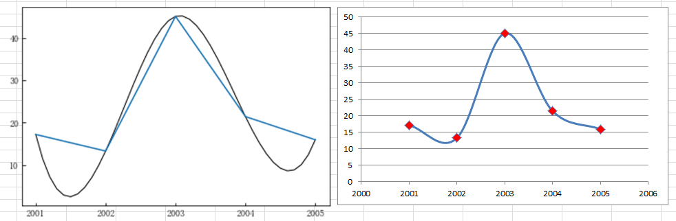
The blue line represents the data linked by the straight line, and the other one, the black line, is what I draw using scipy.interpolate.make_interp_spline. As you can see, between 2001 and 2002, and between 2004 and 2005, the smooth line is obviously lower than the real data. I don’t want to draw like this one. Instead, I want to draw a curve that just turns at or just around the real data rather than lower or higher than the real data. It seems like the smooth line in Excel when drawing a smooth line on the scatter figure, like the right figure above. I just want to use Python to draw a smooth line like this. What should I do?
Looking forward to the reply, thanks.