Not sure whether this is the right place to talk about it, or if I’m using correct terms , but I’d like to say that I’m thoroughly disappointed that PyPI use dark bad patterns for the donation drive. While I understand the need for money, I think that many people would actually be discouraged from donating upon being reminded of the patterns they see far too often, and being disrespected that way.
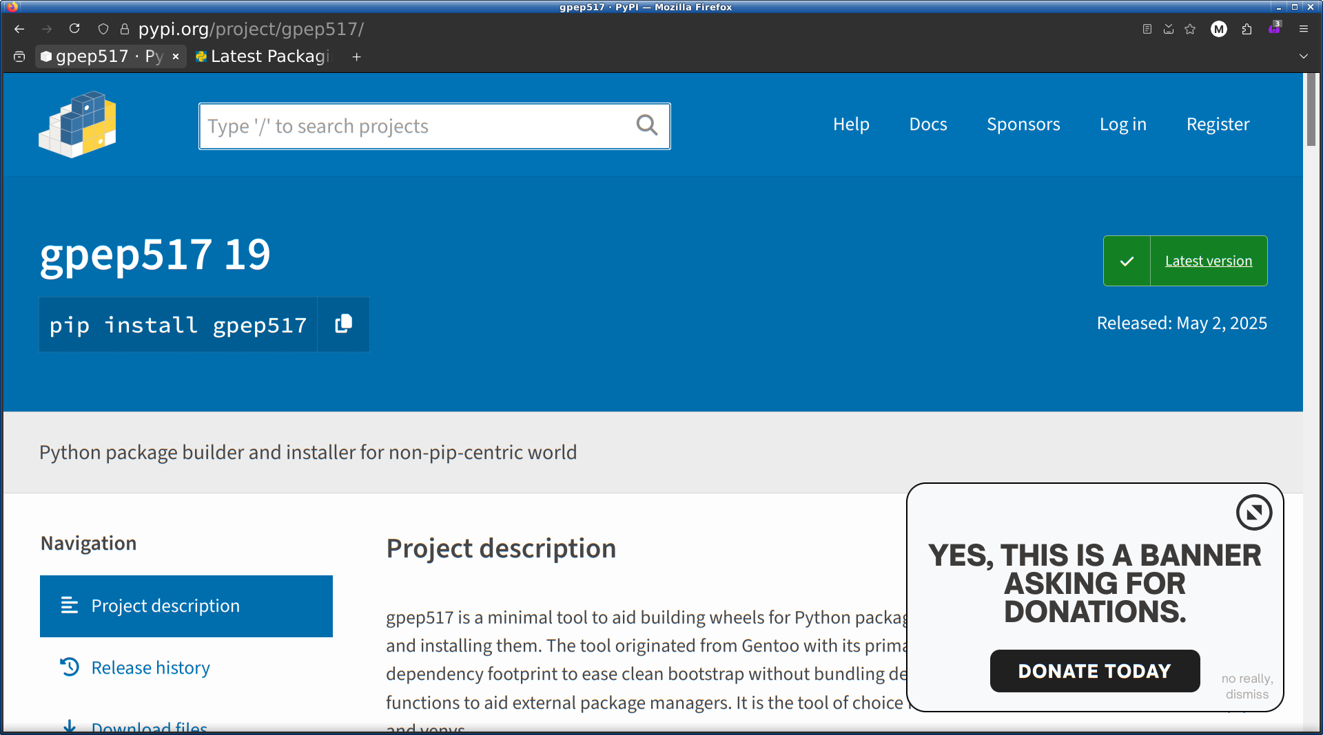
The banner is taking roughly 30% of vertical space, and making reading the site really inconvenient. The “donate today” button doesn’t hide it. Where you’d expect the closing button, there’s a button to make it bigger, and then smaller again. The bigger version has no “dismiss” button, as far as I can see. In the smaller version, the “no really, dismiss” link is barely visible, with a contrast ratio of 1.75:1 and uses a font that is smaller than anything else on the website, constituting a major accessibility problem.
Please reconsider. While raising money for Python is important, I don’t think it really justifies such an approach, and to be honest I doubt that it is actually going to convince more people into donating.
I didn’t realize there was a way to dismiss the banners until you pointed it out. Needed to use a screen magnifier to read the tiny. low-contrast text hiding in an unexpected corner (lower right and only in the smaller box).
Annoyingly overwrought for sure, but I don’t think “dark pattern” applies. That’s for attempts at deception, tricking or manipulating users into doing things. This is just in-your-face. Although putting the “change banner size” size button where people expect to find “close” is arguably a dim pattern .
Hi- chiming in from the PSF side (the org that runs PyPI, and the fundraiser).
Thank you for your feedback. This is our first year trying out pop up banners on python.org and pypi.org, so we absolutely expected feedback, and look forward to improving on the banners for future fundraising campaigns. Your comments have been noted, and will help us consider how to improve user experience for next year. Thanks again!
Side note: aiui, this is one of the most successful individual donation/membership fundraisers we’ve ever run! And most of our hits on https://donate.python.org are coming from either python.org or pypi.org, so the banners are convincing at least some people
I agree with your analysis, but FWIW I think this unfairly imputes intention where I don’t believe any exists: I don’t think any of the PyPI maintainers intended to mislead here, only that banners as a class frequently have them. I think the more charitable conclusion would be that the PyPI admins referenced prior art for banner designs, and most prior art has at least a few dark patterns or accessibility flaws in it.
(This might seem pedantic, but I think it’s part of assuming good faith on everyone’s part.)
Agreed 100%, I don’t think there was an intention to manipulate here. Having said that, I was personally disappointed when I saw the intrusive banners. Results matter, and if this is resulting in increased donations, that’s a good thing - but the PSF has a reputation for a very high level of integrity, and I’d hate to see us eroding it by chasing donations too aggressively.
Perhaps the stripe at the top where links to the developer surveys go would’ve been a good middleground.
For me, it’s a knee-jerk reaction to block anything that intrusive – even though the cause is one I’m strongly sympathetic towards, #fundraiser-banner-host reluctantly went into my ublock filters almost immediately.
When I saw the banner first, I also felt a little irritation inside me.
My 2c.
Rewrite “YES, THIS IS A BANNER ASKING FOR DONATIONS”` to “We’re grateful for every bit of support you can offer”.
Three buttons, equal sizes, colors may vary: “Donate now”, “Remind me later”, “I don’t want to donate”.
If somebody donates or clicks on “I don’t want to donate”, the banner should not appear anymore for n-days/weeks
That’s good to hear. However, I would dare say it’s not really successful because of the banner design, but rather “in spite of it”. There’s a lot of people who appreciate Python and its values, and want to help out, even if they find the banner disagreeable. I can only speculate that there would be even more if the banner wasn’t intrusive.
I’m sorry, I didn’t mean to accuse anyone of ill intent here. Merely wanted to point out that such practices are actually problematic, and surprised many of us in a negative way.
This sounds like victim blaming to me. Sure, many donation banners have dark patterns. Wikipedia’s said that donations are needed to keep the lights on, but in reality, the Wikimedia Foundation has enough money on hand to run servers for decades. But dark patterns being popular in banners does not make this any less of a bad move, and absolutely does not absolve the PSF of the responsibility for a bad design that makes me absolutely not want to ever donate to the PSF.
But we’re not talking about Wikipedia, we’re talking about PyPI (and maybe the PSF by extension). I don’t know much about Wikipedia’s financials or fund raising strategies, but I do know (or at least, I’m pretty sure) that PyPI hasn’t done this kind of banner before. As such, I think it’s charitable to extend them some laxity in their attempt.
I also don’t think I blamed anyone, so I apologize if anything in that original comment could be read to imply blame.
We don’t seem to disagree. My point was that it’s (seemingly) their first try at this kind of campaign, so rough edges are understandable. That’s the full extent of my position here, not that the banner is in fact good.
This will be my last post on this though. Sorry if I’ve offended you, that was not the intent either.
Closing to avoid further arguing and accusations. People from the PSF and packaging can see and have acknowledged the feedback. A widely observed holiday is currently happening, so please have some patience for staff to deploy a response.. If you are a PSF or PyPI staff and want to post an update to this, please message the mods.