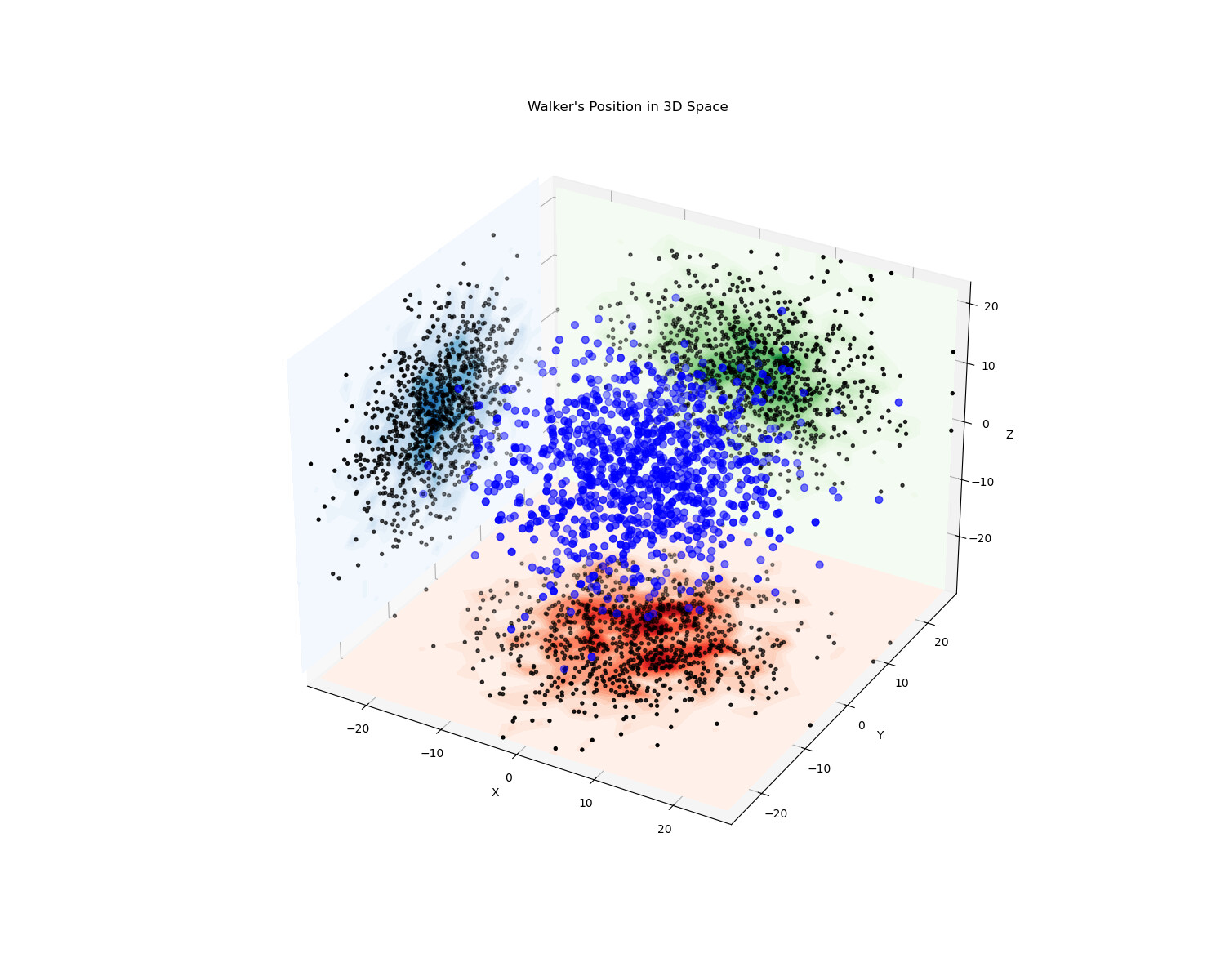
I am currently attempting to plot a contour map that shows the position of a random walker moving in a three-dimensional space on the xy, xz, and yz planes. While I have been able to successfully plot the contour map in the xy plane, I have encountered issues while plotting it in the xz and yz planes. Specifically, the distribution of the map appears strange and is not centred around the zero line as expected.
I am using Jupyter Notebook with Python to generate these plots. I have included the code snippet and the current plot for reference. Could you please suggest a solution for this issue? Additionally, if the problem is resolved, please provide an updated plot.
import numpy as np
import matplotlib.pyplot as plt
from matplotlib import cm

stepsize = 0.5
num_steps = 250
num_trials = 10**3

final_path = []

for _ in range(num_trials+1):
    pos = np.array([0.0,0.0,0.0])
    for _ in range(num_steps+1):
        pos= pos+  np.random.normal(0,0.5,3)
    final_path.append(list(pos))

final_path = np.array(final_path)

x = final_path[:,0]
y = final_path[:,1]
z = final_path[:,2]

fig = plt.figure(figsize = (15,12))
ax = fig.add_subplot(projection = '3d', computed_zorder = False)
ax.scatter(x,y,z, c = 'blue', s = 40, zorder = 2)
# ax.plot(x, y, z, 'k-',  linewidth=0.5, zorder = 2)

ax.scatter(x,y, zs = min(z), zdir = 'z', color = 'black',s = 8, zorder = 1)
ax.scatter(x,z, zs = max(y), zdir = 'y', color = 'black',s = 8, zorder = 1)
ax.scatter(y,z, zs = min(x), zdir = 'x', color = 'black',s = 8, zorder = 1)

counts_xy, xedges, yedges = np.histogram2d(x, y, bins=25)
x_grid_xy, y_grid_xy = np.meshgrid(np.linspace(min(x), max(x), 25), np.linspace(min(y), max(y), 25))

counts_xz, xedges, zedges = np.histogram2d(x, z, bins=25)
x_grid_xz, z_grid_xz = np.meshgrid(np.linspace(min(x), max(x), 25), np.linspace(min(z), max(z), 25))

counts_yz, yedges, zedges = np.histogram2d(y, z, bins=25)
y_grid_yz, z_grid_yz = np.meshgrid(np.linspace(min(y), max(y), 25), np.linspace(min(z), max(z), 25))

ax.contourf(x_grid_xy, y_grid_xy, counts_xy.T, zdir='z', offset=min(z), levels = 25, cmap='Reds', zorder=0)
ax.contourf(x_grid_xz, z_grid_xz, counts_xz.T, zdir='y', offset=max(y), levels = 25, cmap='Greens', zorder=0)
ax.contourf(y_grid_yz, z_grid_yz, counts_yz.T, zdir='x', offset=min(x), levels = 25, cmap='Blues', zorder=0)

ax.set_xlim(min(x),max(x))
ax.set_ylim(min(y),max(y))
ax.set_zlim(min(z),max(z))
ax.set_xlabel('X')
ax.set_ylabel('Y')
ax.set_zlabel('Z')
ax.set_title('Walker\'s Position in 3D Space')

plt.show()