I’m not suggesting we Considering changing the discourse theme - #5 by henriquegogo or anything, but one aspect of the dark-mode theme strikes me as problematic.
Quite a few page elements on Discourse are colored with the var(--tertiary) theme color (defined as #306897), or one of the other variables that hold the same color value. This includes (but is probably not limited to):
-
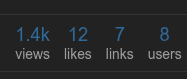
The numbers in all post stats
-
Visited internal links

-
The active tab, in tabbed interface areas (which is styled
color: var(--d-nav-color--active), defined as--d-nav-color--active: var(--tertiary)):

-
The hover state of all links (visited or un-).
…The problem? That shade of blue has a contrast ratio against the theme background color of only 2.69:1, far below the WCAG AA minimum of 4.5:1, to say nothing of the AAA goal of 7:1.
Basically: It’s way too dark. For the most part, the theme has adequate contrast, so it’s surprising this one outlier shade of dim-blue snuck in there. And it’s “not great” that it’s so widely used throughout the interface.
I might suggest going lighter (than the #428fd0 link text) with --tertiary in the dark theme, instead of darker. For instance, #88B3DD has a contrast ratio of 7.22:1 against the background, and while its contrast with the body text color isn’t spectacular (only 1.89:1), the fact that visited links in body text also get underlined helps mitigate the differentiation issues there.
Color-wise, it looks like this:
