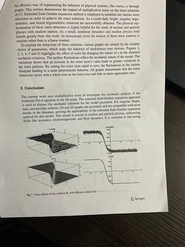
I’ve been searching for a way to plot certain functions across various platforms for a while. I’ve seen similar plots in many research papers, but I only recently realized that they often use Python programs to create them.
I’ve decided to ask for help: I need a program where I can easily input my functions, adjust the parameters, and quickly generate plots. I have several functions to work with, so it would be great if the process is flexible and user-friendly.
Does anyone have an idea of how I can achieve this or know of a tool that fits these requirements?
(-16 * A[0] ** 2 * n ** 4 * (alpha * k ** 2 * m - delta ** 2 + w) * k * (0.5772156649e0 - beta) * 0.1e1 / math.cosh(math.sqrt(n ** 2 * (alpha * k ** 2 * m - delta ** 2 + w) / alpha / m) * (-c[-1] * t + x)) ** 2 * exp(complex(0, 1) * (-k * x + w * t + delta * W(t) - delta ** 2 * t)) / alpha ** 2 / m / (m + n) / (16 * k ** 2 * n ** 4 * A[0] ** 2 * (0.5772156649e0 - beta) ** 2 / alpha ** 2 / (m + n) ** 2 - 16 * n ** 4 * (alpha * k ** 2 * m - delta ** 2 + w) * sigma * A[0] ** 2 * (1 + math.tanh(math.sqrt(n ** 2 * (alpha * k ** 2 * m - delta ** 2 + w) / alpha / m) * (-c[-1] * t + x))) ** 2 / alpha ** 2 / m ** 2 / (m + 2 * n))) ** (0.1e1 / n / 2)
math.sqrt(-0.2400000000e1 * 0.1e1 / math.cosh(-2 * t + x) ** 2 * exp(complex(0, 1) * (1 - x)) / (0.3600000000e0 - 0.16e2 / 0.3e1 * (1 + math.tanh(-2 * t + x)) ** 2))
Hello,
here is a simple example of how this can be done. Notice how a 1-to-1 relationship is created so that we can generate the x-y relationship in the graph.
-
Generate your x values (values into your function to get corresponding y-values).
Notice that you enter the start and stop values to define over what range of values
you want to plot / analyze your function results.
Note that I made a simplification in that I assumed your x-values begin at one value
and increment linearly (all integer values) to another value. This not need to be the case.
Perhaps your x-values are generated as a result of some function output, etc.
-
Use the map built-in function to generate the corresponding y-values.
from matplotlib import pyplot as pl

def sqr(x):
    return  x**2

def mult_5(x):
    return 5*x

def enter_function_for_plotting(func1, func2, start_val, stop_val):

    x_values = []

    for point in range(start_val, stop_val + 1):

        x_values.append(point)

    y1_values = list(map(func1, x_values))
    y2_values = list(map(func2, x_values))

    pl.plot(x_values, y1_values, 'bo', label = 'Squares')
    pl.plot(x_values, y2_values, label='5x')
    #
    pl.xlabel('X-Value')
    pl.ylabel('Y-Value')
    pl.title('Plot Functions')

    pl.legend()
    pl.show()

enter_function_for_plotting(sqr, mult_5,  1, 10)
This examples demonstrates that you can enter a function and plot the results over a given range of values. For the functions that you provided, however, seems a bit more involved since there are multiple variables. Maybe you can hold a few variables constant, while varying two.
Here is a link for 3D plotting:
https://matplotlib.org/stable/gallery/mplot3d/index.html
Hope this helps you.
