5
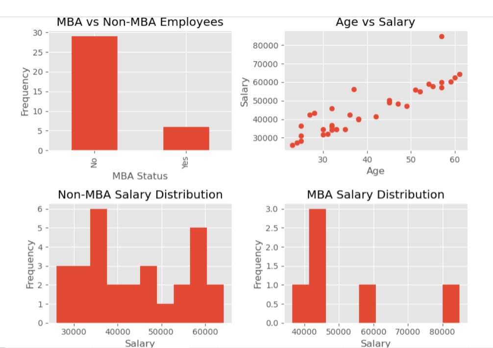
Use [plt.subplot] to create a figure with four subplots (2 rows and 2 columns) as shown below. Specify the figure size to be 8 by 6. Develop all charts using matplotlib (not seaborn). For each chart, include the title, x & y labels as needed.
Chart information:
- Top left: Bar chart showing the counts of No MBA and MBA Employees
- Top right: Scatter plot showing the relationship between Age and Salary
- Bottom left: Histogram showing the salary distribution for Non-MBA Employees
- Bottom right: Histogram showing the salary distribution for MBA Employees
Task 0: Import libaries and load data frame
import pandas as pd
import matplotlib.pyplot as plt
import seaborn as sns
Set the plot style
plt.style.use(“ggplot”)
Load the CSV data file
df = pd.read_csv(r"https://raw.githubusercontent.com/babdelfa/class/main/EmployeeSalaries.csv")
Display a sample of the dataframe
print(df.head())
Bottom left: Histogram for non-MBA employees’ salaries
df[df[“MBA”] == False][“Salaries”].plot(kind=“hist”, ax=ax[1, 0])
ax[1, 0].set_title(“Salary Distribution for Non-MBA Employees”)
ax[1, 0].set_xlabel(“Salary”)
ax[1, 0].set_ylabel(“Frequency”)
Bottom right: Histogram for MBA employees’ salaries
df[df[“MBA”] == True][“Salaries”].plot(kind=“hist”, ax=ax[1, 1])
ax[1, 1].set_title(“Salary Distribution for MBA Employees”)
ax[1, 1].set_xlabel(“Salary”)
ax[1, 1].set_ylabel(“Frequency”)
Adjust layout
plt.tight_layout()
plt.show()
The above is the codes I wrote
and I keep having errors.
Please tell me how I can solve them please