Log-log plot superimposition

requesting to help
I am having a .las file having 6 resistivity data against 6 spacings depth wise.
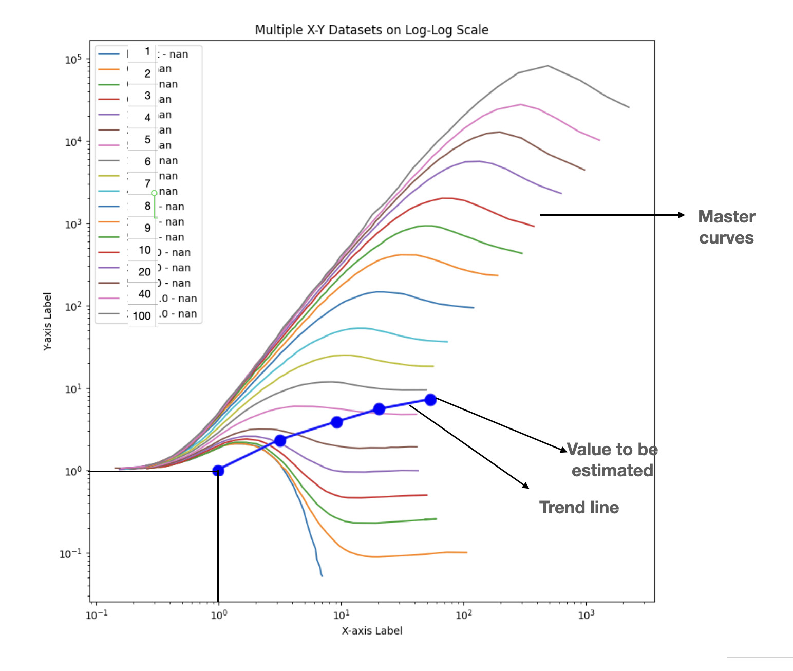
I need first to plot a log-log plot where spacings on x-axis versus resistivities on y-axis. And then to draw a best fitting line.
Then I have to superimpose that trend line on log-log plot of master curves having various resistivity curves. And I have to superimpose in such a way that 1:1 on X-Y. Then the resistivity value of trend line to be estimated by correlation.

Steps:

  1. Load .las data containing 6 resistivity against respective spacings depth wise
  2. Log-log plot of spacings (X-axis) Vs resistivity (Y-axis)
  3. Drawing a best fitting line
  4. That best fitting line need to superimpose log-log plot of master curves data and each curve have specific values(axes should be parallel). Trendline need to be superimposed in such a way that the lowest point need to overlay on 1:1 of X:Y of master log-log plot
  5. Then need to estimate the trend line value by interpolation.

Though I am able to plot and but not able to superimpose properly.
will be very helpful if some solution provided :slight_smile:
regards,
veer

What code do you have so far? What plot do you get, and what do you mean that it is “not superimposed properly”? Is it superimposed at all, or do you see separate plots, or just what?

@ Karl Knechtelkknechtel

import pandas as pd
import numpy as np
import matplotlib.pyplot as plt
from matplotlib.ticker import ScalarFormatter

Load data from CSV file

csv_file_path = “/users/xxxx/xxxxxx/DATA_SAMPLE.csv”
df = pd.read_csv(csv_file_path)

spacings = [0.265, 0.45, 1.05, 2.25, 4, 8]

resistivities = [‘RT0265’, ‘RT045’, ‘RT105’, ‘RT225’, ‘RT4’, ‘RT8’]

Create a log-log plot

plt.figure(figsize=(10, 6))

plt.plot(spacings, resistivities, marker=‘o’, linestyle=‘-’, color=‘b’)

plt.yscale(‘log’) # Set the y-axis to log scale
plt.xscale(‘log’) # Set the x-axis to log scale

plt.xlim(0.01, 10000) # Replace 0.1 and 10 with your desired x-axis limits
plt.ylim(0.01, 10000) # Replace 0.1 and 1000 with your desired y-axis limits

Set x and y ticks with custom labels

x_ticks = [0.01, 0.1, 1, 10, 100, 1000, 10000]
y_ticks = [0.01, 0.1, 1, 10, 100, 1000, 10000]

plt.xticks(x_ticks, labels=x_ticks)
plt.yticks(y_ticks, labels=y_ticks)

plt.xlabel(‘Spacing (m)’)
plt.ylabel(‘Resistivity’)
plt.title(‘Log-Log Plot of Resistivities against Spacings at Depth Point’)
plt.grid(True)

plt.show()

and the trend line need to over lay on this image attached as calibration.png in such a way that the lowest data point of plotted trend line overlay on 1:1 of X:Y of calibration.png. Axes should be parallel. Once it superimposed the trend line value need to estimated by calibration

Steps:
Load the data either in .las or .csv
trend line generation.
overlaying on calibration curve
obtaining value by superimposition.

May pl see and thanks for your reply
Cont: as another image not allowing to attach

Cont: this is the example of final process

@ Karl Knechtelkknechtel