Greetings Pythonistas!
I’ve got a data set in CSV format (available for download here) which spans from July 2019 up to December 2023. It is a collection of activities (and their time intervals) that I’ve meticulously recorded and tracked while doing social science research like Philosophy as well as learning how to program Python and build websites with Django, among other research activities.
To give you a specific example about how I use this tool, if I were to, for example, spend 25 minutes on my lunch hour on my tablet watching Udemy course content teaching the basics of Binary Search Trees, at the end of my lunch break, using an app called aTimeLogger on my Android phone I enter the “Activity” type such as “algorithms”. Next I enter metadata such the date, the start time, and the end time. Then I write an annotation (1-2 sentences) which is sort of like a mental note for my future reference. Other discrete research activity categories could be “Python”, “Django”, “sysadmin”, or even “Magick” / “writing”).
For additional context, over the range of the data set, I’ve spent a total of ~378 hours doing something “Python” related and ~579 hours working on Django course content (or a Django based web project). Those are the two largest categories. The rest of the Activities aren’t as data dense.
My two latest code snippets and graphs can be found here.
Here are my questions:
- In the first snippet and graph below, in my Jupyter Notebook pandas and matplotlib show two categories - - but only partially so. I noticed that when I change the alpha (translucency) variable, the time spent on the different categories overlap each other. How do I stack the data instead? That’s my first question.
import pandas as pd
pd.set_option('display.expand_frame_repr', False)
import matplotlib.pyplot as plt

bulk_df = pd.read_csv('data/all-comments-removed.csv', parse_dates=["From", "To"])
bulk_df['Duration'] = pd.to_timedelta(bulk_df['Duration'])
bulk_df['Duration_hours'] = bulk_df['Duration'].dt.total_seconds() / 3600

# Copy so changes made to python_df dos not affect bulk_df and vice versa
python_df = bulk_df[bulk_df["Activity"] == "Python"].copy()
python_df.set_index('From', inplace=True)

# Calculate rolling means using the index now
python_df['Rolling_Mean_90'] = python_df['Duration_hours'].rolling('90D').mean()
python_df['Rolling_Mean_182'] = python_df['Duration_hours'].rolling('182D').mean()

# Copy so changes made to django_df dos not affect bulk_df and vice versa
django_df = bulk_df[bulk_df["Activity"] == "Django"].copy()
django_df.set_index('From', inplace=True)
# Calculate rolling means using the index now
django_df['Rolling_Mean_90'] = django_df['Duration_hours'].rolling('90D').mean()
django_df['Rolling_Mean_182'] = django_df['Duration_hours'].rolling('182D').mean()

python_df_Month = python_df['Rolling_Mean_90'].resample('MS').sum()
django_df_Month = django_df['Rolling_Mean_90'].resample('MS').sum()
# py_dj_Month_combined = python_df_Month.add(django_df_Month, fill_value=0)

plt.figure(figsize=(14, 8))
plt.bar(python_df_Month.index, python_df_Month, label='Python 90-Day Rolling Mean',width=20, alpha=0.5) # color='red')
plt.bar(django_df_Month.index, django_df_Month, label='Django 90-Day Rolling Mean', width=20, alpha=0.5) #, color='blue')
plt.legend()
plt.title('Stacked Bar Chart for Python and Django Activities')
plt.xlabel('Date')
plt.ylabel('Hours Spent')
plt.show()
That shows as:

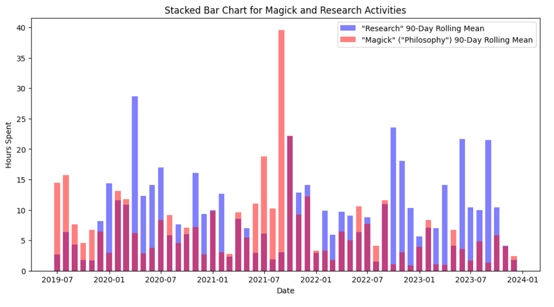
- In the second snippet and graph below, only one category shows up (”Magick”). How do I get the other “Research” category to show? As far as I can tell, the way I handle the data and cast function calls and methods against the two dataframes should work. I’ve been swapping out variable names, tried refactoring, as well as making large and small other changes without success. Who here can identify what I might be missing to get both categories to show (instead of one)? I feel like what I am missing is trivial and obvious. I am hoping another forum member here can point out the blatent error I am making. (My additional intent here is to ensure the bar graph also stacks the data (rather than overlapping) like I have set out to do with the first graph).
import pandas as pd
pd.set_option('display.expand_frame_repr', False)
import matplotlib.pyplot as plt

# Load the data
bulk_df = pd.read_csv('data/all-comments-removed.csv', parse_dates=["From", "To"])
bulk_df['Duration'] = pd.to_timedelta(bulk_df['Duration'])
bulk_df['Duration_hours'] = bulk_df['Duration'].dt.total_seconds() / 3600

# Copy and filter data for "Magick" activity and calculate rolling means
magick_df = bulk_df[bulk_df["Activity"] == "Magick"].copy()
magick_df.set_index('From', inplace=True)
magick_df['Rolling_Mean_90'] = magick_df['Duration_hours'].rolling('90D').mean()
magick_df['Rolling_Mean_182'] = magick_df['Duration_hours'].rolling('182D').mean()

# Copy and filter data for "Research (general)" activity and calculate rolling means
research_df = bulk_df[bulk_df["Activity"] == "Research (general)"].copy()
research_df.set_index('From', inplace=True)
research_df['Rolling_Mean_90'] = research_df['Duration_hours'].rolling('90D').mean()
research_df['Rolling_Mean_182'] = research_df['Duration_hours'].rolling('182D').mean()

# Resample data
magick_df_Month = magick_df['Rolling_Mean_90'].resample('MS').sum()
research_df_Month = research_df['Rolling_Mean_90'].resample('MS').sum()

# Plot the combined data with wider bars
plt.figure(figsize=(12, 6))
plt.bar(research_df_Month.index, research_df_Month, label='"Research" 90-Day Rolling Mean', width=20, alpha=0.5, color='blue')
plt.bar(magick_df_Month.index, magick_df_Month, label='"Magick" ("Philosophy") 90-Day Rolling Mean',width=20, alpha=0.5, color='red')

plt.legend()
plt.title('Stacked Bar Chart for Magick and Research Activities')
plt.xlabel('Date')
plt.ylabel('Hours Spent')
plt.show()