Stats with Python: Binomial Random Variables and the Probabilty Mass Function

Greetings Pythonistas!

I am learning statistics with Python. The current topic I am focused on is Binomial Random Variables (and Distributions). I’m working with an e-commerce website CSV dataset. It contains 5,000 website visitors, of which 16 vistitors made a purchase (“conversion”) meaning the average conversion rate is 0.32% or approximately ~3 purchases for every 1000 visitors.

Here is the official SciPy doc on the binom module which describes the pmf:

https://docs.scipy.org/doc/scipy/reference/generated/scipy.stats.binom.html

Here is my Python code snippet:

import numpy as np
import scipy.stats as stats
from sklearn.linear_model import LinearRegression
import pandas as pd
import matplotlib.pyplot as plt 
import seaborn as sns 

df = pd.read_csv("e_commerce_conversions.csv")

n = 5000  # Number of website visitors
k = (df['converted'] == 1).sum()  # Number of visitors who converted
p = df['converted'].mean() # Probability of a visitor making a purchase
p_norm = p*100 # Normalize p variable
binomial_prob = stats.binom.pmf(k, n, p)

print(f" Number of website visitors: {n}")
print(f" Number of visitors who made a purchase: {k}")
print(f" Probability of a visitor making a purchase: {p_norm:.2f}%")
print(f"{binomial_prob: .6f}")

Output:

Number of website visitors: 5000
Number of visitors who made a purchase: 16
Probability of a visitor making a purchase: 0.32%
0.099377

Here is my question: What is the difference between the probability of a visitor making a purchase (p) paramter passed into stats.binom.pmf() and the output of the probability mass function?

I understand that the conversion rate p of each visit doesn’t change for individual visitors. It’s constant. If another variable were to change such as number of website visitors (less or more), there would be a decrease or increase to p. stats.binom.pmf() then is the calculation that considers the whole dataset of 5,000 visitors. But as you can see in the output above, it says: 0.099377. I don’t know why or how that is the result. When I experiment by adjusting the k (conversion) variable integer by (increasing or decreasing), the output changes. But I don’t understand why. Can someone elaborate or provide some further clarity?

Below are the details of all 16 visitors who converted in my data set of 5,000 enries. The remaining 4,984 are very similar, the only difference is that their data point under the conversion column is 0 instead of 1.

<<< counted = df[df["converted"] == 1].value_counts()
<<< counted
visitor_id  date        country    marketing_channel  converted
109         2024-10-16  UK         Search Engine      1            1
313         2024-10-13  USA        Referral           1            1
461         2024-10-10  UK         Email Campaign     1            1
526         2024-10-30  USA        Referral           1            1
1038        2024-10-18  USA        Referral           1            1
1247        2024-10-11  UK         Search Engine      1            1
1323        2024-10-11  Australia  Referral           1            1
1541        2024-11-05  Australia  Social Media       1            1
1738        2024-10-31  USA        Search Engine      1            1
1802        2024-10-22  USA        Search Engine      1            1
3037        2024-10-11  UK         Referral           1            1
3512        2024-10-16  UK         Search Engine      1            1
3606        2024-11-05  USA        Search Engine      1            1
4222        2024-10-29  USA        Referral           1            1
4228        2024-10-25  Canada     Search Engine      1            1
4711        2024-11-05  USA        Search Engine      1            1
Name: count, dtype: int64
0.32% is your observed/empirical probability. You are using it to infer the probability of a conversion for a new visit.

When you compute binom.pmf(16, 5000, 0.0032), it gives you the probability that, if you have 5000 independently and identically distributed visits (i.e. if the fact that one visit converted doesn’t affect another visit’s conversion probability and if each visit has the same conversion rate), what is the probability that you observe exactly 16 conversions. When the underlying process has p = 0.32%, it is still possible that you observe different number of conversions. You can observe 15, you can observe 17. You can even observe 0 or 5000 (very unlikely but still possible).

On a simpler setup assume you have an unbiased coin and you flip it 2 times. You can observe 0 heads, 1 head, or 2 heads. The probability of observing 0 heads (or 2 tails) is p = 0.5 * 0.5 = 0.25. The same for 2 heads. Since p = 0.5 the most like outcome is 1. But other values are still possible.

What if you flip it 10 times? You can observe 0, 1, …, 10 heads. Each one with a different probability while 5 is the most likely:

In [1]: import scipy.stats as ss
In [2]: N = 10
In [3]: p = 0.5
In [4]: for i in range(N+1):
   ...:     print(f'Probability of observing {i} heads:\t {ss.binom.pmf(i, N, p):.3f}')
   ...:
Probability of observing 0 heads:	 0.001
Probability of observing 1 heads:	 0.010
Probability of observing 2 heads:	 0.044
Probability of observing 3 heads:	 0.117
Probability of observing 4 heads:	 0.205
Probability of observing 5 heads:	 0.246
Probability of observing 6 heads:	 0.205
Probability of observing 7 heads:	 0.117
Probability of observing 8 heads:	 0.044
Probability of observing 9 heads:	 0.010
Probability of observing 10 heads:	 0.001

Now consider a biased coin. You don’t know how biased it is so you decide to experiment. You flip it 5000 times and observe 16 heads. You use it to make inferences for subsequent flips. You can answer questions like:

  • What is the probability that the next one will be heads: 0.32%
  • What is the probability that the next 5 will be tails: ss.binom.pmf(0, 5, 0.0032) = 0.984 (0 heads in 5 flips)
  • What is the probability that if you flip it 5000 times you will observe 16 heads: 0.0934.

So by flipping it 5000 times you constructed a model of that coin. Now assuming number of heads (or number of conversions) is binomially distributed, you have an estimate of its parameter so you can use it to answer questions concerning that distribution.

  • What is the expected number of conversions in 100 views (intuitively it is 100 * 0.0032 but it is also possible to mathematically derive that E[X] = np for binomial distribution).
  • What is the probability that I see less than or equal to 3 conversions in 2000 views (ss.binom.cdf(3, 2000, 0.0032) = 0.1185)
  • What is the probability that I see more than 10 conversions in 2500 views (1 - ss.binom.cdf(10, 2500, 0.0032) = 0.1838)
2 Likes

Thank you Ayhan for your detailed reply. I appreciate the care and effort you put into your response. I am still struggling to wrap my mind around the notion of a probability mass function.

Here is the lead I am grappling with now:

The output of your demo loop is very curious. I noticed a similar pattern when I was experimenting with increasing and decreasing my visitor count. When I increased it to 10000 and progressively change the value in increments of hundreds/thousands (integer values), the binomial probability output floating point number decreased until it reached 0. Similarly, when I decreased the visitor count from 5000 down by a value of a hundred or more, the pmf output float became less and less. So it matches the behaviour that you demonstrated above. 0.099376656370 seems to be the perfect middle.

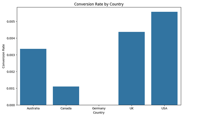
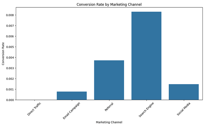
I believe this calls for a visulization. A graph might help me understand better. How do I plot my data as a distribution using pandas? For the sake of visualization and exploring the data, below are some graphs I came up with using pandas and matplotlib which illustrate:

  • Conversion Rate by Country; and
  • Conversion Rate by Marketing Channel

As interesting as this all may be, my next ask from you @ayhanfuat (or anyone else reading this) is: How would I plot a parabolic barplot or histogram (I really think this is the one I need) to illustrate the way the 0.099376656370 is the peak and as the visitors increase vs. decrease, the curve trails off accordingly?

Here are the two graphs I already have mentioned above:

# Group by marketing channel and calculate conversion rates
conversion_by_channel = df.groupby('marketing_channel')['converted'].mean().reset_index()

# Create a bar plot using Seaborn
plt.figure(figsize=(12, 6))
sns.barplot(x='marketing_channel', y='converted', data=conversion_by_channel)
plt.title('Conversion Rate by Marketing Channel')
plt.xlabel('Marketing Channel')
plt.ylabel('Conversion Rate')
plt.xticks(rotation=45)
 # Rotate x-axis labels for better readability
plt.show()

# Group by country and calculate conversion rates
conversion_by_country = df.groupby('country')['converted'].mean().reset_index()

# Create a bar plot using Seaborn
plt.figure(figsize=(10, 6))
sns.barplot(x='country', y='converted', data=conversion_by_country)
plt.title('Conversion Rate by Country')
plt.xlabel('Country')
plt.ylabel('Conversion Rate')
plt.show()

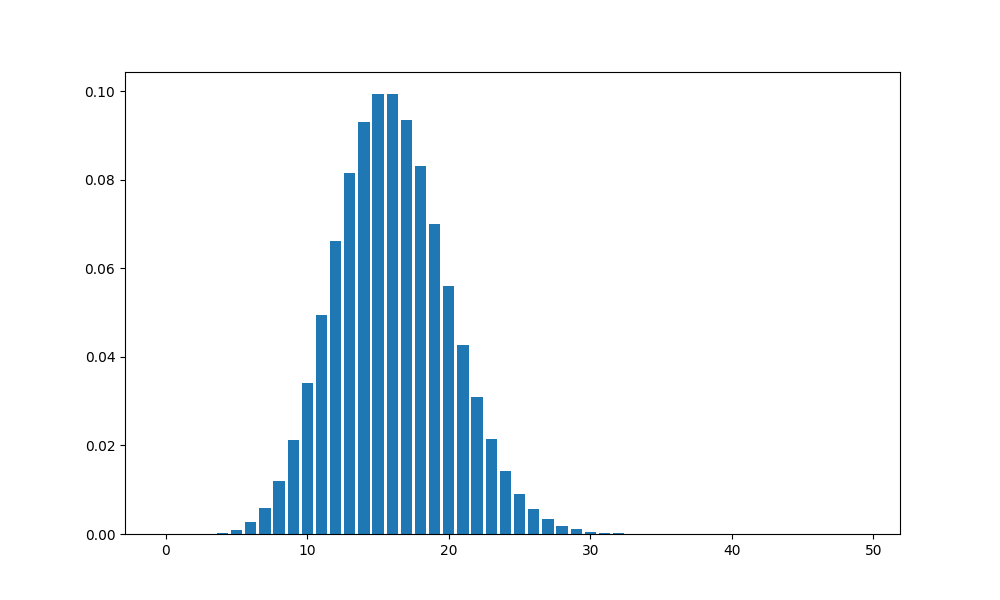
You can create an array of possibilities (from 0 to 5000) and calculate their probabilities. With a bar plot the height then would show the probability of that number.

import scipy.stats as ss
import numpy as np
import matplotlib.pyplot as plt

N = 5000
p = 0.0032
successes = np.arange(0, N + 1)
probabilities = ss.binom.pmf(successes, N, p)

fig, ax = plt.subplots(figsize=(10, 6))
# limiting to first 50 numbers because the rest are practically zero and make the graph hard to interpret
ax.bar(successes[:50], probabilities[:50])
fig.savefig('binom.png', dpi=100)

Greetings! My apologies for the delay in my reply, @ayhanfuat. I am back with progress and more questions.

I managed to refactor your code by integrating it in the context of my ecommerce dataset.

Here is the what I am working with now:

import matplotlib.pyplot as plt
import numpy as np
from scipy import stats

df = pd.read_csv("e_commerce_conversions.csv") # Declare dataframe

n = 5000  # Number of website visitors
p = df['converted'].mean()  # Probability of a visitor making a purchase
p_norm = p * 100  # Normalize p variable

possible_successes = np.arange(0, n + 1)  # Long list of discrete number of potential successes
probabilities = stats.binom.pmf(possible_successes, n, p)  # Probability mass function

print(f"Number of website visitors: {n}")
print(f"Number of visitors who made a purchase: {(df['converted'] == 1).sum()}")
print(f"Probability of a visitor making a purchase: {p_norm:.2f}%")

fig, ax = plt.subplots(figsize=(10, 6))
ax.bar(possible_successes, probabilities) # Plot the bar graph
ax.set_xlabel('Number of Possible Successes')
ax.set_ylabel('Probabilities')
ax.set_title(f'\n Binomial Distribution ( Visitors = {n},  Probability of Purchase = {p_norm}% ) \n') 
ax.set_xlim(0, 36) 
ax.set_ylim(0, .12)
plt.show()

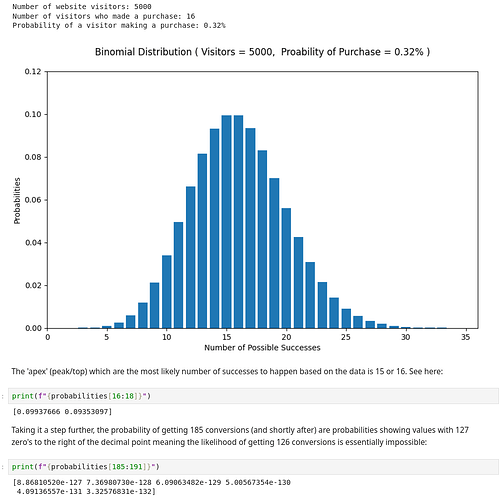
Here is a screenshot capturing the output in my Jupyter Notebook. Be sure to take note of all the output of the print statements and annotations before and after the graph. While I have made great strides of progress in wrapping my mind around binomial mass function, I have an outstanding query which requires clarification which I explain in detail after the screenshot.

The normalized p value of 0.32% isn’t really a “probability”. It’s calculated as a “mean” a.k.a. “average”. So: 0.0032 * 5000 = 16 which is what is given in the dataset. But hypothetically speaking, on a different day or in a different month, when the next 5000 website visitors stop by, it’s more likely that 18 conversions (~0.07 chance) will take place rather than 21 (~0.05 chance) and much (much) more likely than 26 (<0.01) or fewer (and fewer and fewer until reaching astronomically impossible as the x axis approaches to 5000). I think I understand that much. So far so good.

My outstanding query then becomes this: The title of the bar chart says the “Probability of Purchase = 0.32%” and the y-axis label also says: “Probabilities”. To me it sounds like the two probability variables are representing something similar, but they are not. Might it therefore be more accurate to replace “Probability of Purchase” in the graph title to be renamed as:

Binomial Distribution ( Visitors = {n}, “Average Conversion Rate” = {p_norm}% )

This would help distinguish in my mind the difference between the p_norm as a mean() calculation and the probability derived from the biomnial probability mass function binom.pmf() using Python’s statistics module.

Further comments from @ayhanfuat or from anyone else on this message board welcome!

Searching for example Binomial PMF graphs, it looks common the have the word “probability” in both places or to abbreviate with “p=0.32” in the title.

1 Like