Good catch; I just noticed that too.
This was my first thought too, but it wouldn’t look so good and still require modifying each original image to add it, a non-trivial amount of work especially for older PEPs, and which wouldn’t look as good anyway.
I’m personally a bit averse to bespoke hacks in the dark theme CSS/JS for specific PEPs, which switching the image would require, as far as I’m aware.
This seems like the best solution; anchors as in the linked example technically work (via .. invert-image: or similar) but only for one image per page; .. rst-class:: invert-image is a much cleaner solution. CSS filters and the invert() function should be usable on all browsers we support.
One note about SVGs: per MDN via caniuse, “CSS property: filter: On SVG element” is listed as unsupported for all browsers but FF, so if images are not dark mode compatible, we would need to retain PNGs for those images (which currently all displayed images are).
I surveyed the other images that might need this; expand the details sections to view screenshots
-

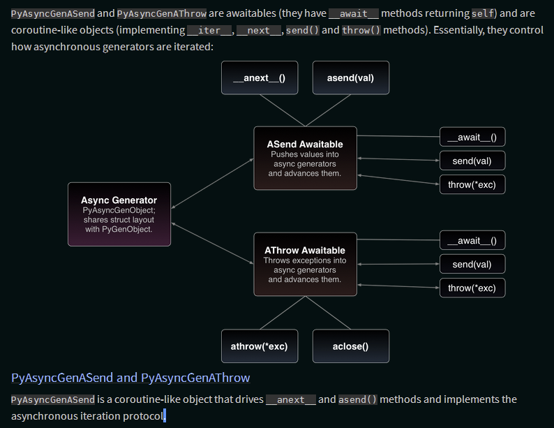
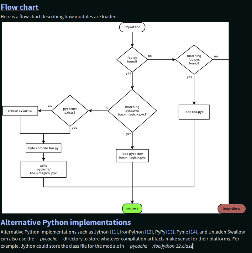
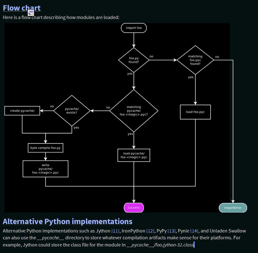
pep-0458-1.png: Arrows between flowchart notes, and other outlines, are invisible; inversion results in a somewhat less conventional color scheme but a far more readable chart. -
pep-0480-1.png: Matches PEP 458 image; see previous entry. -

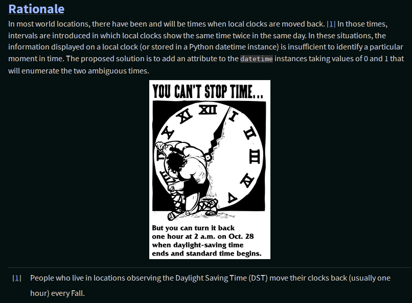
pep-0495-daylightsavings.png: Two-tone image, so could be inverted, but not necessary, doesn’t look great and disturbs integrity of original image. -
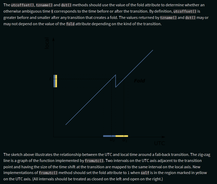
pep-0495-fold-2.pngandpep-0495-gap.png: Needs inverting, as is vector graphics and text is invisible otherwise, which inverting fixes just fine. -
pep-0525-1.png: Looks okay without inverting, but looks even better with it, with higher contrast on the key features while being less blaring on the eyes. -
:
pep-532/circuit-breaking-protocol.svg: It already users background colors for its flowchart boxes, but the arrows between them are black and invisible; while the inverted look isn’t ideal, it is clearer than the alternative. -
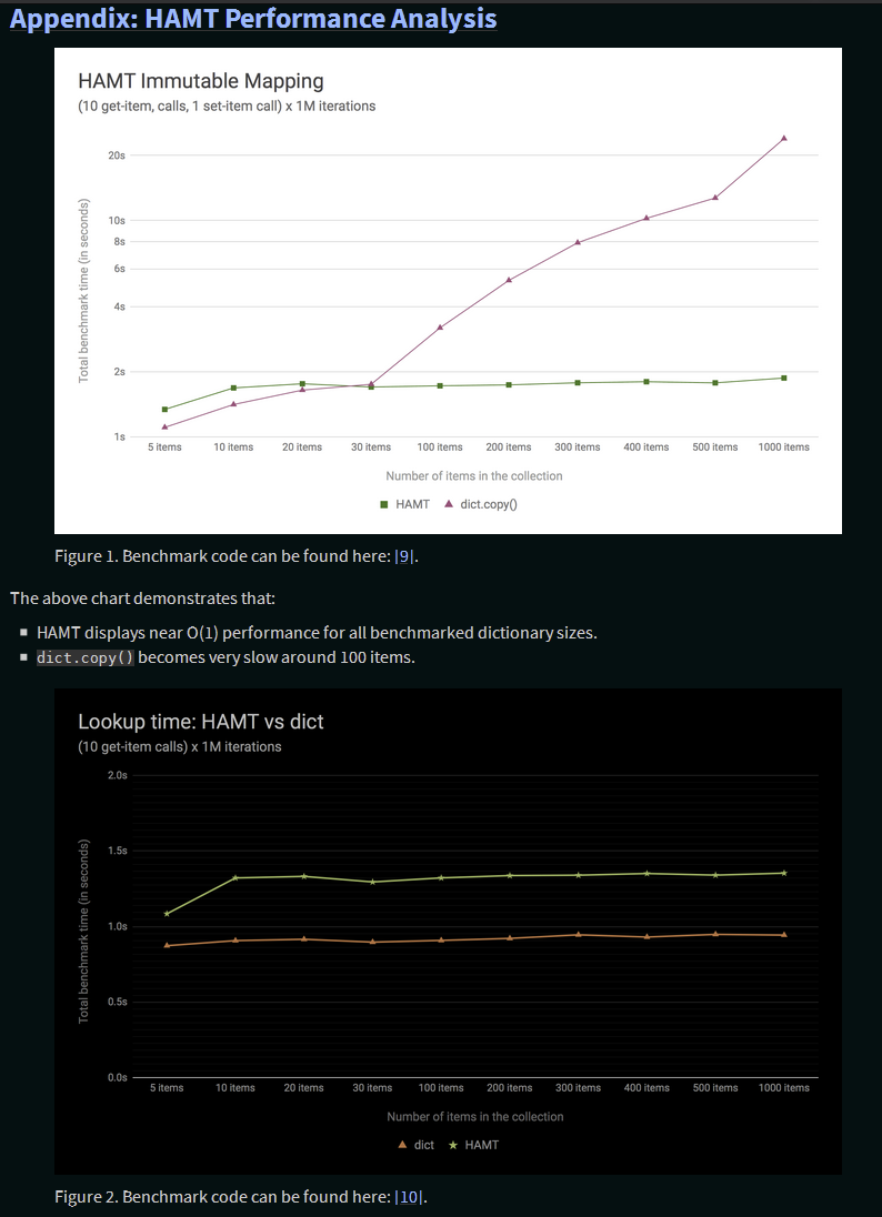
pep-0550-hamt_vs_dict-v2.pngandpep-0550-lookup_hamt.png: Have full white backgrounds, so still read okay without inversion, but are line art and look much less visually jarring and eye-straining with it. -
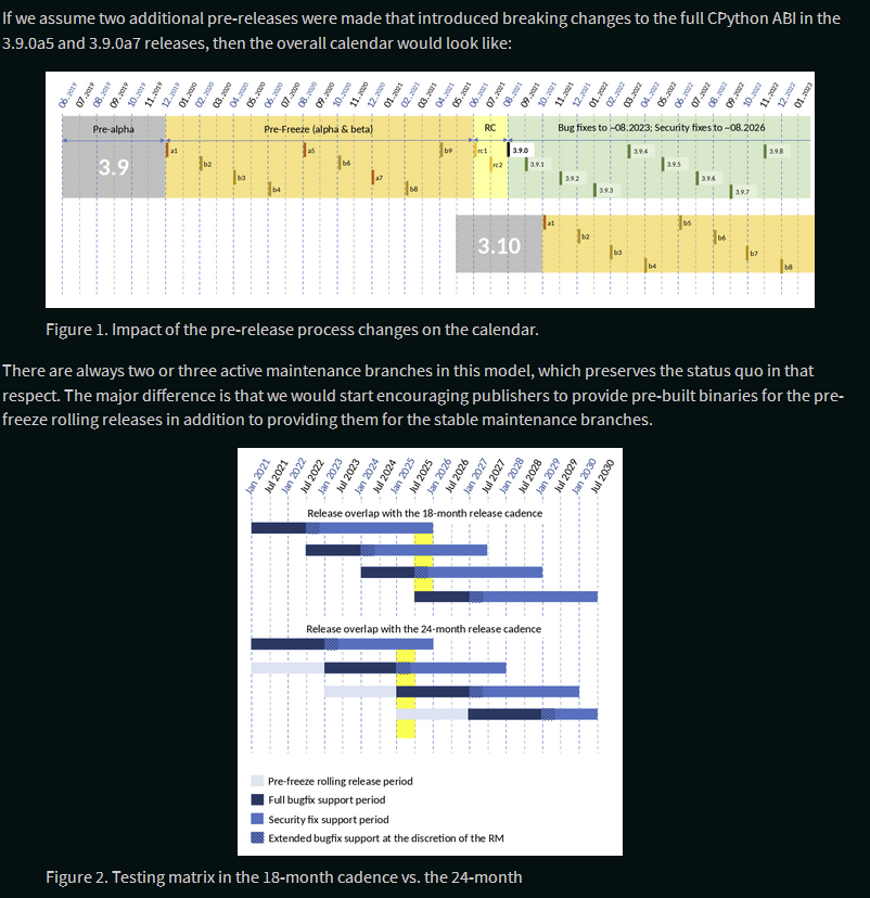
pep-0602-example-release-calendar.pngandpep-0602-overlapping-support-matrix.png: Have a white background, so look rather bright, but rather complex and with deliberately chosen colors, so should not invert these. -
pep-0602-hamt_vs_dict.pngandpep-0602-lookup_hamt.png: Identical figures to those on PEP 550, so same conclusion. -
pep-0605-example-release-calendar.pngandpep-0605-overlapping-support-matrix.png: Same two basic figures as on PEP 602 with minor content differences, so same conclusion applies. -

pep-3147-1.png: Mostly has a white background, but has a strip of transparency down the side (which should be fixed manually). Thus, is readable in dark mode but renders poorly, which inverting mostly fixes.