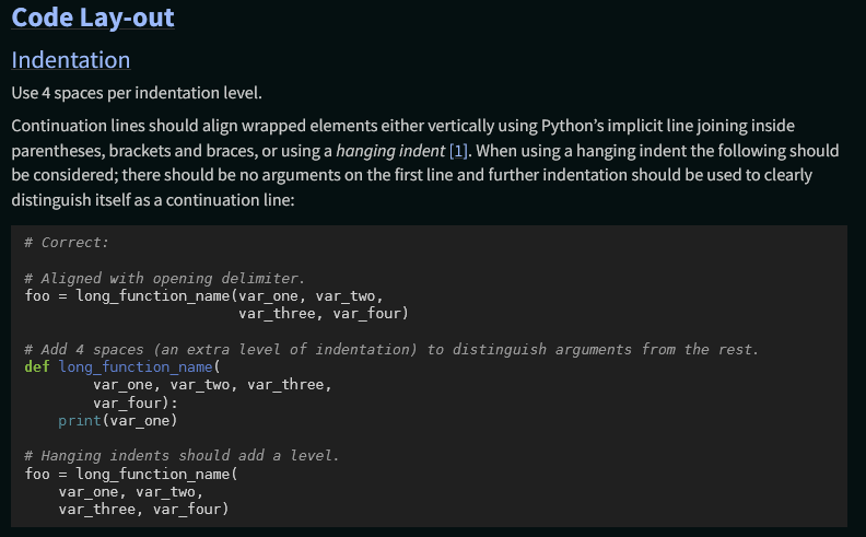
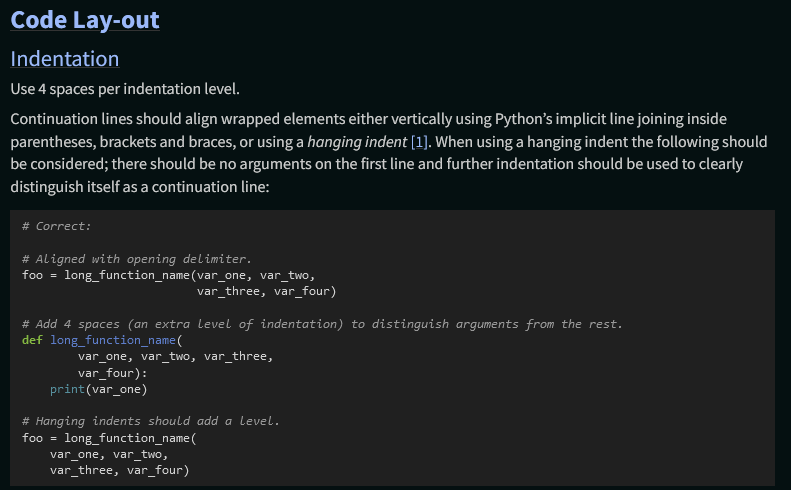
Sure, so long as it doesn’t dip too low that readability is impaired-I’d suggest at least 14 px/0.875 rem to meet the minimum (IIRC) for WCAG AA accessibility standards. The issue with relying on a system font stack gere, though, is that the rendered size varies significantly between different mono fonts, so they may end up substantially bigger or smaller than intended at any given size, and may vary more widely from the sans font (which also varies).
For example, at font-size: 0.8125 rem, DejaVu Mono and Liberation Mono (default on most Linux) both look fairly reasonable (DejaVu Mono shown):
Consolas (the default on Windows), however, is significantly smaller:
Yep, there’s several other styling tweaks we need to do with them; see python/peps#2300. Adam said he’s going to be busy for at least the next few weeks if not longer with school stuff, so if he can’t take care of it in the next day or so (since after that is when he said he’s going to be taking a break, FYI), you or I can take care of it.
Agreed with @hugovk , I’m a strong ![]() on PRs improving readability, usability and accessibility when issues arise.
on PRs improving readability, usability and accessibility when issues arise.
@hugovk did, citing your Furo. It certainly can make sense in a large, popular, general-purpose theme like Furo, where the goal of the project is ensuring the theme looks good across platforms, OS versions, browsers and user configs.
My big concerns for the PEPs, where favoring a well-defined, unified cross-platform design language is more justifiable, center around the consistency and maintainability of the theme’s “look” across many different possible combinations of sans, serif and mono fonts, given how (per my testing above) these can vary widely depending on the aforementioned variables outside of our control, and ensuring that the intended relationship of the mono and sans font sizes is fairly consistent (though making it further apart, as proposed here, reduces though not eliminates the latter concern).
As someone experienced using a system font stack for a popular Sphinx theme, it would be very helpful if you had anything to share wrt your experience with it, how you test to ensure your theme’s look is correct and consistent across the variables and that there aren’t problematic edge cases, and how you deal with the relationships between sans, serif and mono fonts varying substantially between them?

