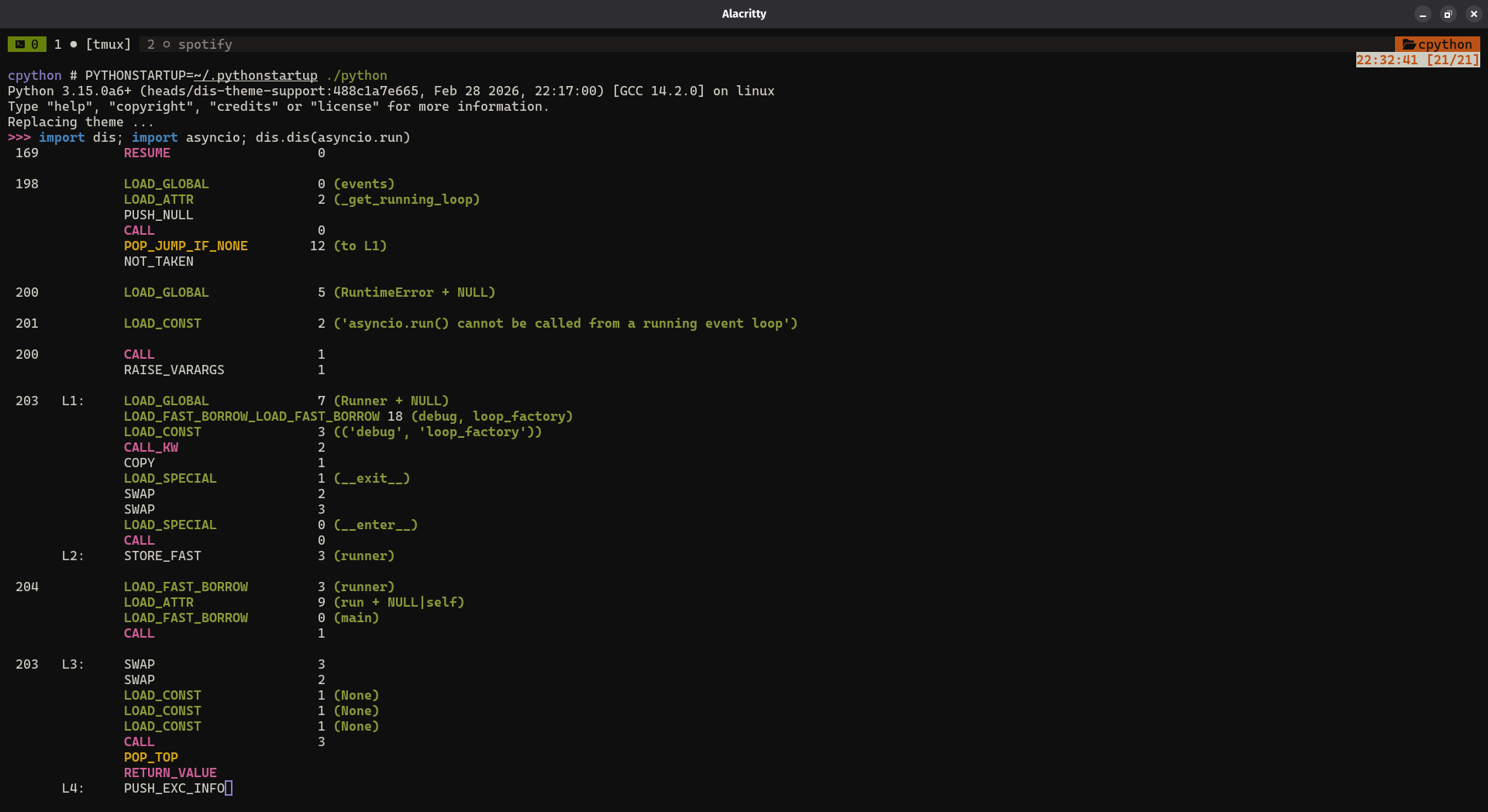
Syntax highlighting is good addition to improve readability, and the way of giving a context to special parts of output text. Adding it to dis module can be considered as developer experience enhancement.
I have minimal “proof of work” implementation (I see issues with spacing, for now – difference in outputs when NO_COLOR is set, but anyways):
Highlighting can also be more context specific. For instance, different color for unary, binary/in-place … opcodes (= in the way opcodes groupped in documentation of dis module).
Highlighting does not introduce any breaking changes, it can be disabled too – if user does not want where it implicitly follows NO_COLORstandard, which is implemented in ThemeSection.no_colors (and here).
I haven’t seen where this idea was proposed/discussed (in forum, github). I would like to hear your opinions. Any ideas & criticisms are appreciated.
Yes, this could good. Another idea may be to use the same colour for LOAD_*, and another colour for POP_* and another for RETURN_*, and so on. It’ll be good to get input from people who use dis more often than me.
If I had a magic wand, I’d only colorize labels and jumps instructions, because that shows me program flow at a glance. So all the .L123, …JUMP…, and …CALL….
Though I’m sure there are heavier users of the dis module than me and they might have different opinions.
Looks cool! Another possibility: Would be nice to be able the stack-effecting operaitons - loads and pops. I mostly use dis.dis() to explain to people what actually happens in code, and to compare optimizations.
Not ONLY highlighting those, but giving a clear colour to them, and different colours (ideally counterparts in some way) so they can be easily eyeballed.
Adding color to the dis output is a great idea. I’d just caution to not make too colorful. That could instead make it even more difficult to parse.
Comparing both screenshots, the initial and the last one, I honestly would prefer the first from a readability standpoint. Just because the colors don’t get in the way.
The contrast on the names and constants in grey is bad. Better to use fewer colours and limit yourself to ones that have good contrast. Personally, I’d prefer all the opcode names to be the same colour; the white glare from BUILD_MAP and BUILD_SET has a distracting effect on me when reading the neighboring instructions.
I guess users should be able to configure the colors themselves. This way you don’t have to spend too much time trying to find a set of colors that pleases most people (or, rather, the biggest proportion of users agreeing, which could be something like 15%), and everybody will be able to customize it to fit their needs/requirements (not too colorful, very specific items highlighted, color blindness, dark themes, light themes, etc.).
I use same theming approach as pyrepl (e.g. difflib unittest, traceback …). Just like pyrepl theme, it(dis)’s theme also should be configurable (haven’t tried yet). I guess by keeping both default scheme & allowing users to customize everything is the best.
A sensible terminal[1] already lets you configure what RGB values the old-school 16 ANSI color codes map to so a CLI that sticks to those is automatically theme aware[2], color blindness aware, bright-color disableable[3] and high/low contrast tuned.
This recent surge of (usually rich using) CLIs that try to be clever in fact achieve the opposite of what they’re hoping for – either providing a hardcoded theme I can’t read, a selection of hardcoded themes I still can’t read or forcing people to write they’re own themes that are just a repeat of the color preferences in their terminal.
I think anything except Windows’s legacy conhost ↩︎
as in really theme aware – not just this light vs dark thing ↩︎
a lot of people find the bold/bright colors distracting ↩︎
Thanks for this suggestion but I now have some thoughts on this:
Having the op value (rightmost column) colorized can somehow be a visual burden. I’d suggest leaving it as is for now. Have we considered using italics instead of colors for some ops? I have the feeling that for real cases, having colors everywhere like that won’t help more. Don’t get me wrong here, I don’t have a better suggestion. It’s just that I feel that I am more distracted by the colors than by the content itself.
OTOH, if it is possible, I would rather have applied colors to an entire sequence of “grouped instructions”. For instance, when you encounter a CALL, I think it would make sense to show what is actually being part of the CALL instead. It would be much more helpful to know the stack at that point. For instructions that are not related to what is before or after, they can their own colors (that is, in addition to group instructions by line numbers, grouping them within what they are would also makes better sense IMO).
For instance, in godbolt, the disassembly of h in
int f(void) { return 1; }

int g(int x) { return x + 2; }

int h(int z) {
    int l = g(f()) + 3;
    return l;
}
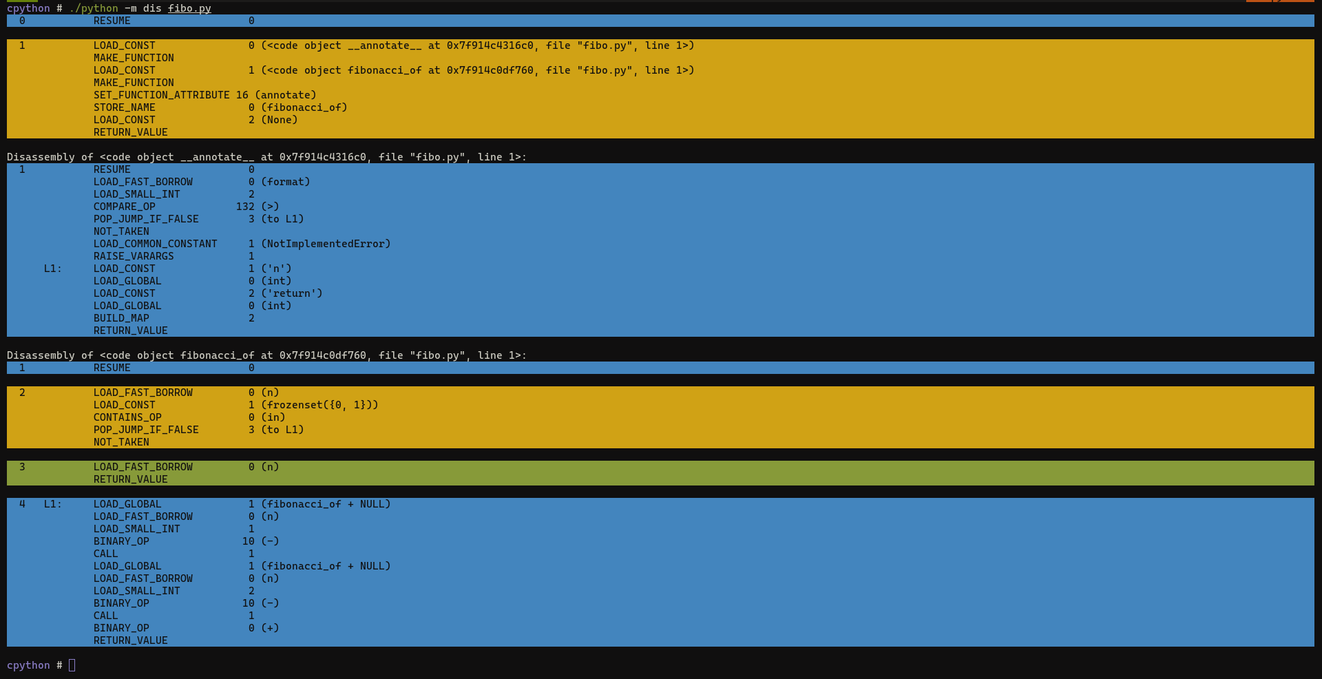
Each colored section represents a single line. They don’t highlight each instruction. We already split the diassembly output by lines, but we could add soft coloring for each of these blocks (note that instructions spread on different lines are still colored with the same color).
… Have we considered using italics instead of colors for some ops? …
Till now - no, I would. Are they widely supported (in terms of ANSI)
Regarding “coloring entire sequence of grouped instructions” - I really like the idea! Haven’t thought about this. I’ll try to come up with different prototype to see the possibility.
The highlighting of different lines is similar to tables with alternating row colors. IMHO it is sufficient to have two alternating background colors, and they could even be relative subtle like black and dark grey.