Thanks for your reply!
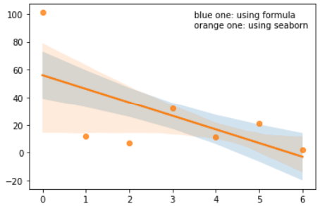
I found that seaborn.regplot tends to draw asymmetrical confidence bands when the y data is ‘steep’, just like the data in this example (shown at the top of this page). But I don’t know why. Furthermore, when I try to regress very steep and waved data, the interval calculated by seaborn.regplot(x, y, ci=68.27) has a huge difference with that calculated by the formula you told me before:
y_err = (np.array(y)-y_est).std() * np.sqrt(1/len(x) + (x - x.mean())**2 / np.sum((x - x.mean())**2))
The difference in the confidence intervals can be easily noticed in the figure below, which I use the following code to draw.
import numpy as np
import matplotlib.pyplot as plt
import seaborn as sns

x = np.arange(7)
y = np.array([101,12,7,32,11,21,2])
n = x.size

# calculate interval manually using the formula
a, b = np.polyfit(x, y, deg=1)
y_est = a * x + b
y_err = (y-y_est).std() * np.sqrt(1/n + (x - x.mean())**2 / np.sum((x - x.mean())**2))

fig, ax = plt.subplots()

# plot manually calculated interval (std interval) --- the blue one
ax.plot(x, y_est, '-')
ax.fill_between(x, y_est - y_err, y_est + y_err, alpha=0.2)

# plot seaborn calculated interval (std interval, i.e. when ci=68.27) --- the orange one
sns.regplot(x=x, y=y, ci=68.27)

plt.text(3.5,90,'blue one: using formula\norange one: using seaborn')
plt.show()
Looking forward to your reply about why they are not the same, and which one I should take (using formula or using seaborn). Thank you!