Almost no modern website immediately underlines every link. The visual clutter significantly degrades readability. Instead, the best practice is to ONLY show the underlines when a user hovers over a specific link:
We sometimes see websites link underlines are used for the major links with similar semantic meaning, but not for every link on a webpage or for every internal cross reference:
I don’t understand why we would accept being worse than everyone else, including major websites that have had accessibility audits. Perhaps we could at least consult with a graphic design professional to get a clear statement of why Python docs have unique needs that necessitate our making a strikingly different decision than other leading websites?
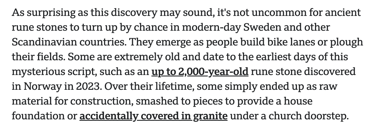
For me personally, the docs are really hard to read now. I have to actively look past the clutter. That might be easy for some people, but not for me. Here’s an example of simple paragraph text that can no longer be read like plain text:
One reason why I wouldn’t want links being underlined is when they contain underscores. Usually, English text doesn’t contain underscores but because of snake_case and dunder methods, Python’s documentation is full of underscores and having them underlined is hard for me to read them.
OTOH, I tried removing the underlines and … it’s not necessarily better for words without underscores. It’s harder to distinguish them from regular text and it just looks like colored text. I don’t know how hard it can be, but since it’s only a CSS change, we could offer another theme.
Do you know why the docs are inconsistent in this regard? The table of contents pages still have the old underline on hover logic:
That’s because the CSS being used is different. The table of contents is a table and the links are inside a table, so they use the rule for table.contentstable a and not the rule for a[href] (the former suppresses decorations). In the CSS file it says /* No underline for navigation */ but I agree that it’s a matter of choice here. I think the purpose here was to suppress links on the navigation bars, but one class ended up being in the text itself (or maybe it was deliberate I don’t know).
On the contrary, best practice is to underline links. The WCAG guideline (which itself uses underlines) says it’s important not to rely on colour alone for links:
The objective of this failure is to avoid situations in which people who cannot perceive color differences cannot identify links (when people with color vision can identify links). Link underlines or some other non-color visual distinction are required (when the links are discernible to those with color vision).
I agree there are too many linked items in that section. We only need to link to things on the first mention in each unit, so could remove around half there. See our style guide. PR welcome.
Like any medicine, the dosage is important. Used sparingly, underlines can draw the eye to links. But in sentences with multiple links, the eye gets drawn everywhere making it hard to tune-out so that a reader can focus on the actual text.
The guideline says “not to rely on colour alone” but doesn’t mandate underlines specifically. A graphic design professional would tell us that there are other tools to set off the secondary information (links) in a way that doesn’t interfere with reading the primary information (the text).
In papers, we see footnote links with superscripts⁴ or bracketed references [AWK-92]. Presumably this is so you can still read the paper (the primary information) and not be overwhelmed by the references (the secondary information).
The CPython docs have sections that require a high density of links. They also incorporate identifiers that have underscores or double underscores. In both situations, the “medicine” is contraindicated. It makes the text less readable for everyone, including people who cannot perceive color.
For me, the core issue is that in some examples, I now struggle to read the sentences from beginning to end. The pile of links are like bright flashing billboards on the side of the road making it hard to pay attention to the other cars.
What do you suggest instead? I don’t think superscripts or bracketed references would be better: they also interfere with the flow of prose, and in a programming language context could be mistaken for syntax.
We could at least remove the links to the second pair of str or bytes in that one.
(I note the linked graphic design page is inaccessible in that it relies on colour alone for links.) You’re right, we don’t have to use underlines. The key is to make links visually identifiable with something other than colour alone. For example:
To use this technique, an author incorporates a visual cue in addition to color for each place where color alone is used to convey information. Visual cues can take many forms including changes to the font style, the addition of underlines, bold, or italics, or changes to the font size.
I don’t think we can change the font (we use monospace for code) or italics (used for parameters and other things), and I don’t think bold or a different size would help. Underlines are well known to be links.
I find footnote links with subscripts do a disservice to readers – first they have to click once to get to the footnote, and then click again to reach to the destination. An inline link takes you right away there, and you can click back once, not twice. Sometimes when you click a footnote superscript, and you’re taken to the bottom of the page, it’s not always clear which the corresponding footnote link is. And due to our link density, there would be a huge number of footnotes (but not quite as many as this :)). We’ve been recommending against such footnotes for recent PEPs.
Yes, by virtue of being reference documentation, it is useful to be able to cross-link to other places. But as mentioned, we can reduce the link density to follow the style guide. This needs volunteers willing to do the work, PRs welcome.
We have different CSS for code compared to regular text, so the underline is lower on code to avoid obscuring the underscores.
The collections ABCs table? This is essentially a table of contents, the links in the first column are needed. We could reduce repeats in the other columns to first mention. PR welcome.
In my experience, “graphic design” pages tend to be among the worst for a11y, perhaps since the goal of selling you a slick design is at odds with actually having the site be usable by all.
ISTM that this is the tail wagging the dog. In many cases, a high density of links is necessary and useful. If a link isn’t needed, take it out. But a lot of the links (term definitions, etc) are helpful.
It is ironic that the goal of underlines was to make links easier to find, but the proposal is to do away with many of the links entirely.
That said, it is good progress to have some acknowledgement that some of the docs are harder to read than they used to be.
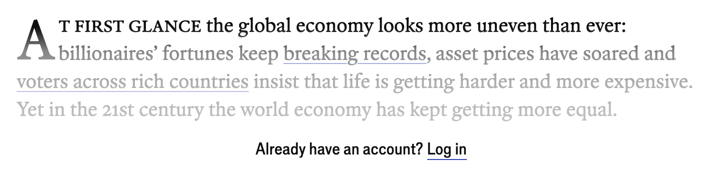
However, plenty of popular websites have ditched underlines: The New York Times, New York Magazine, The Washington Post, Bloomberg, Amazon, Apple, GitHub, Twitter, Wikipedia.
A lot has changed in six years: interesting that all of those except Wikipedia (and perhaps Twitter/X but I’m not going there) have re-added links to prose!
Yes, that’s exactly what the style guide reference is about: not linking object.__len__ 20 times in a paragraph for the documentation of the len function, for example.
I also found the underlined links a bit difficult to read, though they’re very useful on touch-only screens where you can’t hover to tell whether something is a link or just styled text. That said, a softer underline style might be easier on the eyes.
(For context, my eyes were already fatigued from other close-work tasks earlier, which likely made this feel harder to read than usual )